홈페이지의 메인(Index) 페이지의 구성은 매우 중요하다. 홈페이지에 접속 했을 때 가장 먼저 만나게 되는 페이지고 메인 페이지에서 홈페이지의 성격을 파악하고 중요한 정보를 제공 받을 수 있다. 메인 페이지는 그 홈페이지의 얼굴이라 할 수 있다.
홈페이지 레이아웃을 구성하는데는 용도에 따라서 다양한 형태가 있지만 기업형 홈페이지는 상단에 메뉴들이 나열되고 그 아래에 기업에서 홍보하고자 하는 제품을 소개하거나 게시판의 최근 글을 불러와 해당 페이지로 이동하지 않아도 최근에 등록 된 게시글을 확인 할 수 있도록 하고 있다.
아래 예제는 최근 보편적으로 많이 사용되는 레이아웃 구성이다. 과거에는 화려하고 복잡한 레이아웃을 선호 했다면 최근에는 단순하고 실용적인 디자인을 많이 추구하고 있다.
파일 명 index.php
<!DOCTYPE html>
<html>
<head>
<meta charset="UTF-8">
<title>멀티미디어공학</title>
<link rel="stylesheet" type="text/css" href="./style.css">
</head>
<body>
<div class="title_box">
멀티미디어공학과
</div>
<nav>
<ul>
<li>Home</li>
<li>Project</li>
<li>Service</li>
<li>Download</li>
<li>About</li>
<li>Contact</li>
</ul>
</nav>
<div class="visual_box"></div>
<div class="product_box">
<div class="subject">Marketing stuff!</div>
<div class="docu">Cras justo odio, dapibus ac facilisis in, egestas eget quam. Fusce dapibus, tellus ac cursus commodo, tortor mauris condimentum nibh, ut fermentum massa justo sit amet risus.</div>
<div class="btn"><input type="button" value="DOWNLOAD"></div>
</div>
<div class="content">
<div class="span4">
<h2>Heading</h2>
<p>Donec id elit non mi porta gravida at eget metus. Fusce dapibus, tellus ac cursus commodo, tortor mauris condimentum nibh, ut fermentum massa justo sit amet risus. Etiam porta sem malesuada magna mollis euismod. Donec sed odio dui. </p>
<p><a class="btn" href="#">View details »</a></p>
</div>
<div class="span4">
<h2>Heading</h2>
<p>Donec sed odio dui. Cras justo odio, dapibus ac facilisis in, egestas eget quam. Vestibulum id ligula porta felis euismod semper. Fusce dapibus, tellus ac cursus commodo, tortor mauris condimentum nibh, ut fermentum massa.</p>
<p><a class="btn" href="#">View details »</a></p>
</div>
</div>
</body>
</html>
파일명 style.css
body { text-align:center; }

.title_box { width:1000px; text-align:left; margin:auto; padding:20px; font-weight:bold; font-size:20px; }

nav   { height:60px; }
nav ul  { width:1000px; margin:0 auto; padding:0; }
nav ul li { float:left; list-style:none; height:30px; line-height:180%; margin-right:-1px; width:16.5%; border:1px solid #D3D3D3; background:#F8F8F8; }
nav ul li:first-child { border-radius:3px 0 0 3px; }
nav ul li:last-child { border-radius:0 3px 3px 0; }
nav ul li:hover  { background:#FFFFFF; cursor:pointer; }

.visual_box { clear:both; width:1000px; margin:auto; height:313px; overflow:hidden; background:url("/image.jpg"); }

.product_box { width:1000px; margin:auto; padding:50px; }
.product_box .subject { font-size:80px; }
.product_box .docu  { font-size:30px; }
.product_box .btn input { border:1px solid #82C682; border-radius:2px; padding:10px 20px 10px 20px; background:#59B359; font-size:15px; font-weight:bold; color:#ffffff; }
.product_box .btn input:hover { cursor:pointer; background:#C0E2C0; color:#59B359; }

.content { width:1000px; margin:auto; border-top:1px solid #EFEFEF; border-bottom:1px solid #EFEFEF; }
.content .span4 { float:left; width:33%; text-align:left; }


.visual_box { clear:both; width:1000px; margin:auto; height:313px; overflow:hidden; background:url("/image.jpg"); }
이미지를 보여주는 곳에 이미지의 경로를 url()로 잡았다. 여기서는 절대경로를 이용해 root(홈 디렉토리)의 이미지 파일을 불러왔다. 이미지는 1000px * 313px의 크기로 따로 준비한다.
디렉토리를 접속 해 보면 점으로 구성 된 아래 두 개의 디렉토리를 볼 수 있다.
./
../
위의 점 하나로 된 디렉토리는 현재 자기 자신을 의미한다. ./image.gif는 현재 위치에 존재하는 image.gif를 뜻한다.
점 두개로 된 디렉토리는 부모 디렉토리를 의미한다. ../image.gif는 현재 위치에서 바로 위의 부모 디렉토리를 의미한다. 바로 위의 부모 디렉토리에 있는 image.gif를 가리키고 있다.
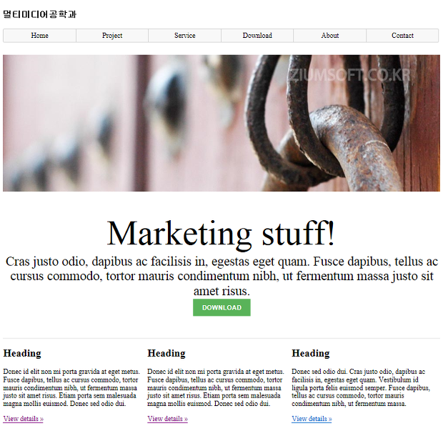
만약 위의 코드가 정상적으로 실행 됐다면 이런 화면을 볼 수 있다. 지난 시간에 배웠던 CSS와 태그의 속성들을 공부하다보면 어떻게 이런 레이아웃이 나왔는지 파악해 보자.
'프로그래밍 > 홈페이지 제작 기초' 카테고리의 다른 글
| 7강. viewport를 이용한 모바일 홈페이지 작성하기(HTML 코딩) (0) | 2019.09.21 |
|---|---|
| 5강. MySQL 데이터베이스에 저장(Insert) 된 레코드를 수정(Update)하기 (0) | 2019.09.21 |
| 4강. MySQL 데이터베이스에 저장한 정보를 읽어서(select) 화면(브라우저)에 출력하기 (0) | 2019.09.21 |